Creating Images With ChatGPT – Color and Camera Terms To Help
You may have heard that ChatGPT can create images using its image creator tool, DALL-E. But if you’ve ever tried it, you probably have some pretty wacky results. It turns out that getting DALL-E to create images that actually match your vision takes a bit of finesse.
Luckily, there are a few simple cues, especially around color choices and camera effects, that can help steer things in the right direction. I’ve been learning about these tricks myself, and I want to share what works so you can get images that come out looking closer to what you had in mind.
Getting Started
First, if you haven’t tried creating images with ChatGPT or didn’t know it was possible, you’re in for a treat! Using ChatGPT’s DALL-E tools, you can generate custom images by describing what you want in words. It’s a creative way to visualize ideas, but it helps to know a few basics to get started. For the best results, try to be specific with descriptions, especially when it comes to colors, lighting, and focus. Small details like these make a big difference in getting an image that matches what you’re picturing in your head. And don’t be afraid to experiment—practice is the best way to find what works!
Here are three simple tips to help beginners get started with creating images in ChatGPT:
- Start with Clear, Simple Descriptions: Begin by describing your image idea in straightforward terms. Think about what you want as if you were explaining it to a friend—mention the setting, main elements, and any specific colors or moods.
- Use Key Details for Extra Clarity: Adding details about lighting (like “soft lighting” or “hard shadows”), colors (warm or cool tones), or camera effects (like “shallow depth of field”) can guide ChatGPT to create images closer to your vision. See below for details.
- Experiment and Adjust: Don’t worry if your first try isn’t perfect! Adjust your description or try different combinations of details to see what works best. The more you experiment, the more you’ll learn about what settings and cues give you the look you want.
As always – don’t think of this process as “using software.” Think of it as talking to a creative partner. The more clarity and detail you provide, the better the outcome will be.
Color Terms
I’ve put together a list of terms to give you a feel for each option, along with some tips on when they’re most useful. Whether you’re aiming for bold, vibrant colors or a cozy, nostalgic vibe, here’s a rundown of some go-to choices that can really bring your images to life.
- Vibrant: Intense, saturated colors that make the image pop. Use this when you want bold, lively visuals that grab attention.
- Muted: Softer, desaturated colors that give a more subtle, calm feel. Ideal for creating a relaxed or nostalgic atmosphere.
- Monochrome: An image rendered in shades of a single color, often black and white. This can emphasize texture and light contrasts, giving a classic, dramatic look.
- Sepia Tone: A reddish-brown color filter that gives an old-time, vintage feel. This is great for historical or rustic imagery.
- Warm Tones: Use reds, oranges, and yellows to create a cozy, inviting feel. These tones evoke warmth and energy.
- Cool Tones: Use blues, greens, and purples to create a calming or serene environment. These colors are often associated with professionalism or tranquility.
- High Contrast: Strong difference between light and dark areas, making elements in the image stand out clearly. This is good for dramatic or eye-catching effects.
- Pastel: Soft, light colors that create a gentle, airy feel. This is often associated with light-hearted, playful themes.
Camera Terms
- Depth of Field (Shallow or Deep):Shallow Depth of Field: The subject is in focus, while the background is blurry, drawing attention to a specific element in the image.Deep Depth of Field: Both the foreground and background are in focus. Great for landscapes or images where all details matter.
- Wide Angle: Captures a broader scene with a sense of space or depth. Use this for landscapes or when you want to showcase a large area.
- Close-up/Macro: Focuses tightly on a specific detail, such as a face or an object, making it the main feature of the image.
- Soft Focus: Creates a slightly blurry effect, softening the image and adding a dreamy or romantic quality.
- Hard Lighting: Produces sharp, defined shadows, creating a dramatic or stark look. Often used for high-contrast, intense images.
- Diffused Lighting: Light is scattered and softened, reducing harsh shadows and creating a more flattering, even look. This gives a gentle, natural feel.
- Lens Flare: When light enters the lens at an angle, causing bright spots or streaks. It can add a creative or cinematic touch.
- Motion Blur: Adds the effect of movement, where fast-moving subjects appear blurred, giving the image a sense of action or speed.
- Bokeh: The aesthetic quality of the out-of-focus areas of an image, often seen as soft, circular blurs in the background. This adds a visually appealing texture behind the subject.
Let’s Try Out Some Combinations
Mixing and matching different options can totally transform the vibe of your image.
Combining various elements gives you endless ways to bring your ideas to life and create the exact feel you’re aiming for.
Here are a few examples of color and camera combinations i used with one specific “Dog In Autumn Field so you can get a sense of how these details change the image.
Hopefully, this helps and inspires you to try your own combinations!
Some Examples
[By the way, I revisited this article 1 year later just to see if there’s any difference. I am showing the output of the same directions side by side]
Let’s create an image of dog in an autumn field muted monochrome with a shallow depth-of-field image of a dog in an autumn field
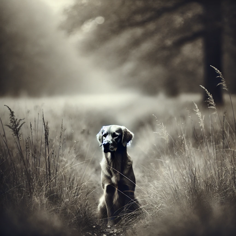
2024
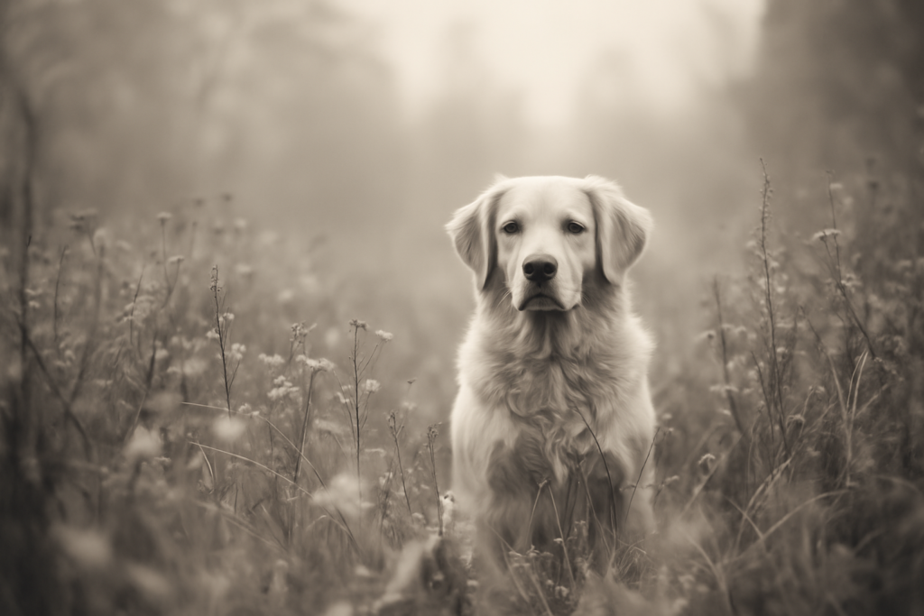
2025
NEXT PROMPT: OK, let’s create an image… I’d like a muted warm tones with a shallow depth of field image of a dog in an autumn field
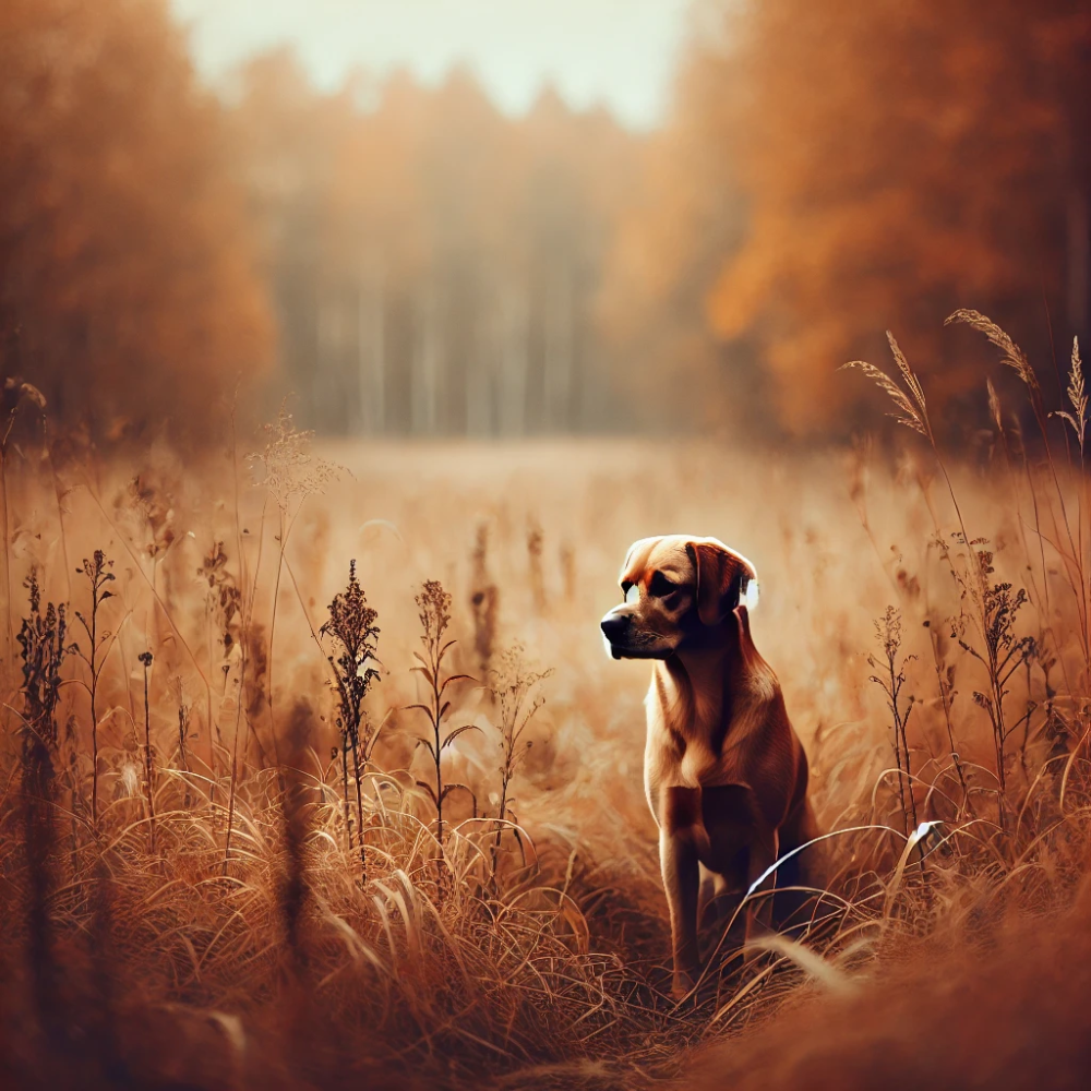
2024
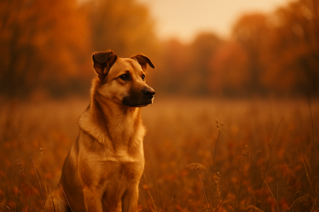
2025
NEXT PROMPT: I’d like a hard contrast monochrome with motion blur image of a dog in an autumn field
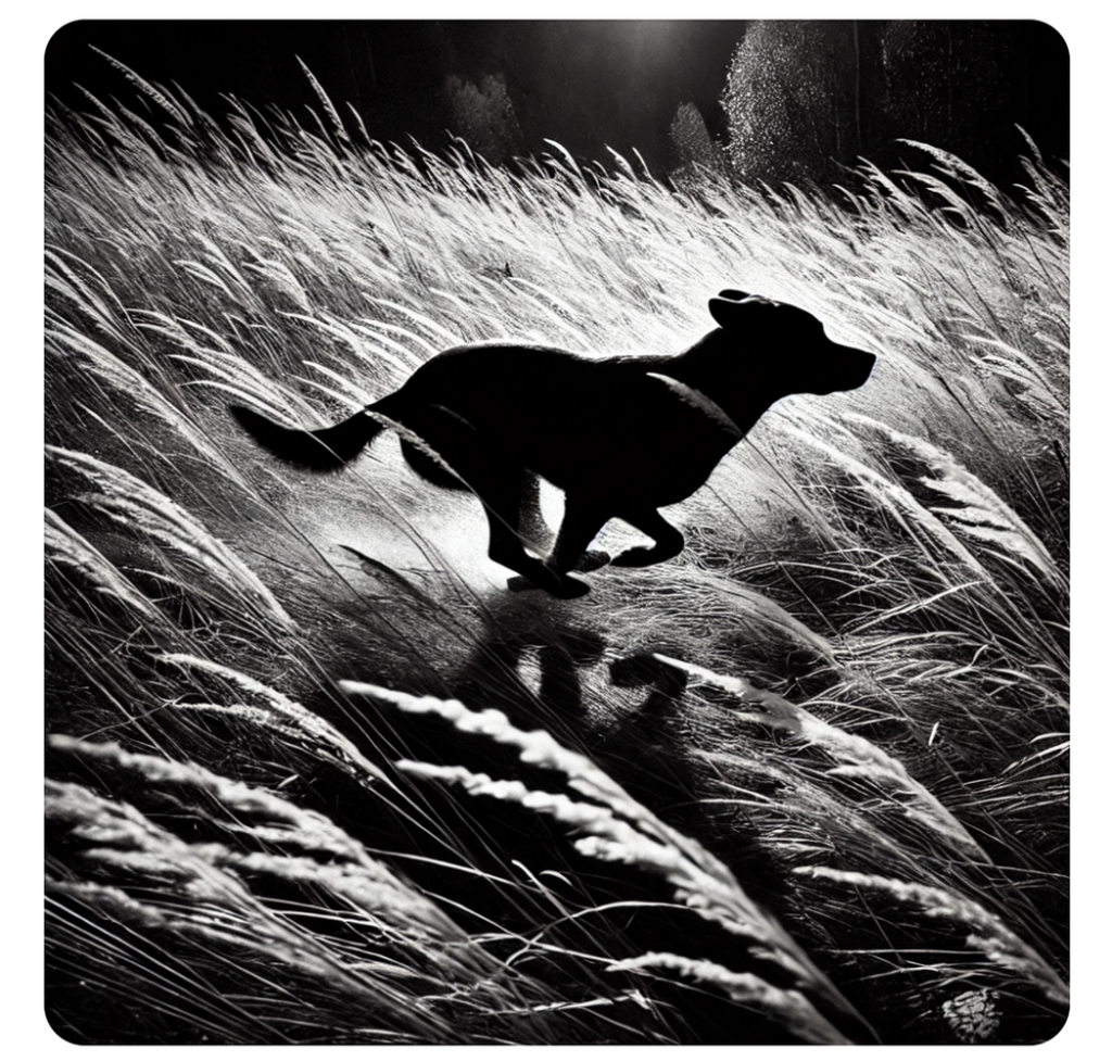
2024
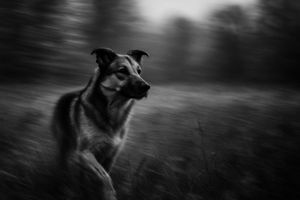
2025
NEXT PROMPT:ok..lets dog in field, vibrant, high-contrast color with shallow depth of feel
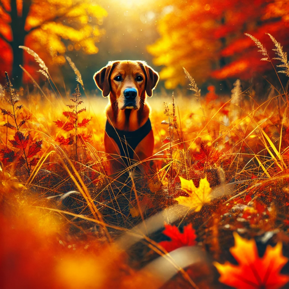
2024
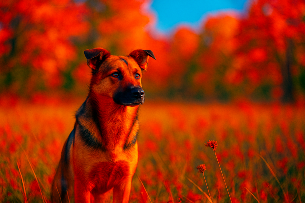
2025
Some Simple Tips
- Start Simple: Choose one color style and one camera effect at first, then layer on more as you get comfortable.
- Experiment with Light: Hard lighting adds drama, while diffused light creates softness—try both to see what matches your vision.
- Use Depth of Field for Focus: A shallow depth of field keeps the focus on your main subject, perfect for portraits or close-ups.
- Think About Mood with Colors: Warm tones feel cozy and inviting, while cool tones create a calm, peaceful atmosphere. Choose based on the mood you want.
- Play with Motion and Detail: Use motion blur to add a sense of energy, or close-up details to emphasize texture and focus.
Conclusion
Creating images with ChatGPT and DALL-E can feel like discovering a new creative superpower. With just a few color and camera cues, you’re already on your way to bringing your ideas to life in ways you might not have imagined. So, don’t be afraid to experiment—try mixing different styles and effects until you find the look that feels right. The more you play around, the more you’ll learn what works, and soon enough, you’ll be making images that really reflect your vision. Happy creating, and remember: every image is a chance to explore and have fun!
-Cary